This]]This is my readers profile and it is a brief and straight forward guide to my magazine. It gives the readers information about who reads the magazine and what the own and what there like. It shows what kind of target audience your magazine has for example 80% of my readers own a pc, this suggests there young and modern. I got the idea from NME magazine as they feature some every now and then. It's important for a magazine to know what type of people also read the magazine.
This is my first draft of my double page spread, i wanted to include a pull quote, a headline and a small article within the double page spread. I like the headline font and i think the pull quote gives anchorage to the image. The image is fun and lively and shows that the band is fun and lively.
I really like the masthead font and also the pull quote it look vintage and retro, exactly what the band is. The image is a little pixalated the article seems abit squashed in.
I like this image, it look like there both having fun and enjoying themselves. I like the lighting and the background and the clothing the models are wearing suit my genre of music.
In this image the models are acting innapropratly and i couldnt possibly use this image. You can see the bannister and part of the light aswell as the black flooring, all three shouldnt be in the image.
I like the idea of the image, with Euan infront of zak but Euans face comes across quite aggressive and i want them both to come across fun and proffesional.
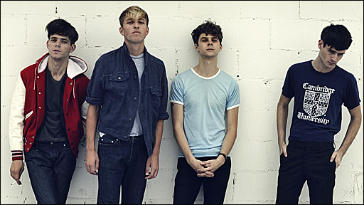
I really like this image and would love to use it for my double page spread but ive taken the picture portrait instead of landscape so i need to retake it as a landscape so it will across my double page spread. I could use it and put an article on the other side but id prefer the image to be on both sides of the double page spread.
This is my first draft of my contents page, i wanted include the regulars and features but I'm going to fill them in with information. I like both image as there relevant but on my proper contents page ill make them more relevant by putting a brief description about them. I'm going to change the background to make the contents page a little more vibrant and also change the masthead to make it stand out more.
This is my final contents page. Im really pleased with it and im happy to use it. I used the features and regulars down the side with information about them all and the page numbers, each highlighted in red. The masthead is much more noticeable and it instanly catches your attention. Ive put brief description about the images which gives the reader information about the images.
This is my first front cover draft, i used all selling techniques and a colour scheme but still im not pleased with the outcome. I think the masthead should be placed above the artists head and i could improve the image, there is a soft box in the corner of the screen which shouldnt be there and there isnt any information about the main headline. I do like the banner line and main headline along with the sell lines and puff.
I like this draft, there isnt enough selling techniques but i like the initial idea of it all. The idea was to have the artists holding the world in there hand and underneath the image a pull quote stating they have the world in there hands. I like the banner headline and the sell lines but there isnt enough selling techniques within the front cover, i need to include more information. I like the font for the masthead it looks messy, like the genre of the music. Im going to use this image but just include more selling techniques and clean it up a little.
Im taking ideas from both of these drafts, i like the masthead in both and i prefer the second image as it appeals more. Im going to use the sell lines and headlines from the first image and also use the puff in the first image.
This was the first image i took and i wanted the two models to pretend there holding the earth. I was planning on photo shopping an earth into there hands, looking like they have the whole world in there hands. I'm not so keen on the lighting in this photo and Euans facial expressions proves he wasn't ready for the picture.
I'm really pleased with how this image has come out. I like the stance of the models and the facial expressions. Zak is serious all serious with his arms crossed and Euan just looks like he's having fun. I like the lighting in this image, it comes across Zak's body all the way into Euan's. The space above the models head is acceptable and im pleased with the outcome.
I like the stance of the models and the lighting but there is a few faults with this image. Behind Zak is a stool which shouldn't have been there and above Zak in the corner of the screen is a side of the soft box appearing. There isnt enough space within the image as the main image takes up all the space.
I'm really pleased with this image and would like to include it within my magazine. It's a full body shot, so you can clearly see the style of the genre the models are and you can also see there facial expressions and postures. I would of liked abit more space above there heads to fit a title and maybe had them abit closer to each other to give me abit more space to work with.
These are my hand drawn drafts of my double page spreads, contents page and front cover. I have done two different designs for each page, using different selling techniques in each.
Front cover I want my front cover to represent my lively, vibrant target audience and the genre of music it's representing. I want it to represent indie/rock, so i want it to be vibrant and retro as it appeals to the audience. The bands features will be suitable for my genre and will represent the target audience. I want my bands to be young and loud, with a lot of volume, this will connote the name of the magazine. I want my magazine to be vibrant and bright, just like my target audience also quite plain so there isn't too much on one page. My masthead,kicker,sell lines and pull quotes will stand out and be recognisable. I will do a full body shot for the front cover so the audience gets an understanding of the band and there image and i want all the attention to be based on them. I want to include two band members stood next to each other looking serious about there work, i want to include a mid close up shot, i want there expressions to be lively, like there enjoying themselves.
Contents page My contents page will include features and regulars of the magazine and also relevant images that are featured within the magazine. I want my contents page to help readers find the page they want, easily and quickly. I don't want to much writing on the contents page but just enough to help the reader find there page. I want the contents page to inform, direct and persuade readers. I will include an image of my featured headline band with a brief description of there article.
Double page spread My double page spread will feature the bands featured on the front cover, to keep continuity. I'm going to include an image, main headline and a pull quote in my article. I want the double page spread to be a fun and enjoyable read with humorous. I want the image on the double page spread to fill the page and be dominant and have an edgy and dynamic feel to it. I want my double page spread to be informative and enjoyable giving the reader interesting facts about the new band and its genre. I'll include one main image covering one whole page with a pull quote and headline and on the other page will include an article about the featured band.
I have decided on volume as my music magazine name. I decided on the name as it both represents my magazine and it's target audience. It represents my target audience as loud music appeals to them and the name sounds trendy and dynamic. Volume is also to do with electricity, so i want the font being edgy and different, i like the first one as it looks like it's been scribbled on or graffitied on, giving it a dynamic feel.
I want the name for my music magazine to represent my target audience and genre of music. I want to it to have a meaning and relate to music in some way. I decided to ask around friends and looked on the internet for some ideas but mainly came up with the names on my own. I decided that they must relate to music and stand out as an interesting name. Name ideas
. Turn it up
. Amplify
. UAC
. Smash
. Control
.Volume
The colours im going to use in my magazine are dark calming colours that stand out. The colours look quite retro and vintage which would appeal to my target audience and i think also there quiet calming colours to look upon. The colours look natural and fresh like the artists i want to express within my magazine.
Light blue is associated with health, healing, tranquility, understanding, and softness. Dark blue represents knowledge, power, integrity, and seriousness. Light red represents joy, sexuality, passion, sensitivity, and love Black is associated with power, elegance, formality, death, evil, and mystery
I want my magazine to cost around £2.00 and to be published weekly. I believe £2.00 is a resonable price for my music magazine and my target audience's socail class, as it is a price everyone can afford and it's not to expensive. I want my magazine to be published weekly, as i want to express new musical talent to the readers as quick as possible. It won't be all about the class but more about the music expressed within it. My target audience will mainly be students and i believe £2.00 isnt to expensive for them and for £2.00 they will get all the information they need along with free posters and exclusive interviews.
I would like my music magazine to be similar to all of the three magazine's i researched. Nme magazine appeals to me as the magazine has a wider range of audience than other mainstream magazines. They achieve this by the music expressed every week and how the price appeals to all socail classes. Q magazine has quality and the reader get's what they pay for by the quality of the paper and the quality of the artists featured. Kerrang magazine express there genre as much as they can and use colour and attractive images to draw the reader in. I would like to use all the magazine's seperate qualities and put them all together in to my magazine to create a popular magazine that appeals to a wide range of audience and all socail classes. I also want it to be recognisable and unique to any other mainstream music magazine. I want people to recognsise the house splash and know that's it's my magazine.
The target audience for my music magazine would be aimed at teenagers and young adults aged from 15-24, this is would be my demographic. I believe the genre of my magazine which is Indie/rock will appeal to my target audience as the genre is popular within that age range and appeals to them more than any other genre of music. The genre of indie/rock is at it's most popular stage in it's musical history and it's popular because most indie/rock bands have been featured in the media, in magazines, on television and on the radio. There are many aspirational indie/rock artists around, that my target audience will aspire to and this will draw them in to my magazine. My target audience will also appeal to people of all social statuses and will be all about the music instead of the social class. I want the audience to have an interest in new and upcoming young indie/rock bands that they can look forward to and who they may aspire to be like in the future. I want my target audience to be interested in the features of indie/Rock as well as the music, indie/rock musicians have an individual image and style and i want my audience to recognise that. By looking at the physcographics of my target audience I've been able to recognise the differences that suit my target audience and that will suit my magazine. My target audience are alternative and have individual styles. There is a particular look for an indie rock star, they usually dress in vintage, retro clothing which represents there genre and play fast upbeat music that will be played in clubs to make people dance.
My music magazine will be focusing on the genre of Indie/Rock. Indie/Rock is my favourite genre of music and i know what appeal's to that audience as it appeals to me. The genre itself is everywhere, it's been played in clubs,pubs on the radio and even on the television, it's in magazines and in newspapers, you can find it anywhere. The key features of the genre are the image of the band and the music they produce. There is a particular look for an indie rock star, they usually dress in vintage, retro clothing which represents there genre and play fast upbeat music that will be played in clubs to make people dance. The band's are usually young and attract a young audience that aspires to be like them. There is a massive market for the genre with the youth hooked on the music and purchasing songs and clothing from the bands. The lyrics used by Indie/Rock bands are mostly about enjoying life and having fun, the music makes you want to dance and enjoy your youth, its music you'll listen back to when your 20 or 30 years older and reminisce your younger years. At this moment in time, indie/rock is the biggest most popular genre around, there is a vast following of indie/rock and the majority of upcoming acts are indie/rock artists. On the majority of magazines i researched, i realised that they all had a similar theme, Indie/rock had been featured in them all. If i had to choose a mainstream magazine that is currently in publication that covers this genre, it would NME magazine because it covers the genre of Indie/Rock and has become very popular because of it.
These are some popular indie/rock bands that are featured within mainstream music magazines. These are the bands that will influence the music genre in my magazine and the bands i have aspired to be like. Id like to include bands like this in my music magazine as these bands represent my target audience.
Q magazine uses a variety of different codes and conventions on it's front cover. The house style for Q magazine is always the same, this is for regular buyers to recognise it. The splash has been given an organised well presented design which is culturally accepted within the fans of Q magazine. The magazine features the legendary rock star Bruce Springsteen, giving an exclusive interview to Q magazine and it has a feature about the music festival Glastonbury, which he will be playing at. The masthead of the magazine, entitles"Q" which could suggest quality, it could also be interpreted as part of the well known saying "Q the music". The masthead has been placed on the top left hand corner, this is conventional.
The main image displays the well known rock star, Bruce Springsteen through a full lentgh body shot. He looks calm, relaxed and ready and is resting against an amplifier, holding his guitar, as if he's to go and play at a festival. He looks straight in to the camera, interacting with the audience, creating a visual effect. The banner line states that Bruce Springsteen is the boss of his life and doesn't let anyone order him around. His name is boldly written and is in white to stand out, to emphasise his legendary status and giving anchorage to the main image. The font is quite simple, they don't need anything fancy to attract there audience as other conventions are more important. Above the banner line, it says "the only interview", giving the magazine an exclusive and an interview no other magazine has got. The colour scheme for this magazine uses the colour white, white could represent coolness and cleanliness and also white is considered to be the colour of perfection. All these representations could be related to Bruce Springsteen as he is a popular, legendary musician, who for many is the king of cool.
The front cover is promoting the music festival, Glastonbury. It is previewing who will be playing at the festival and features Bruce Springsteen as the main feature as he will be the main feature at Glastonbury. Q magazine are using Bruce Springsteen as the artist on the front cover as he draws in a wide range of audience as he's so popular and versatile within the musical world, however he is promoting himself and his views within an exclusive interview with the magazine and making the audience aware of his performance at Glastonbury.
At the top of the magazine, there is a banner saying " the UK's biggest music magazines" this could suggest an arrogance and could say that it is the best developed therefore the best music magazine around, it also in capital letters enthesisingthe biggest.
On the magazine the left third includes, a strap line about the Bruce Springsteen interview, and exclusive pictures of blurs musical life. On the bottom of the front cover, it tells us what bands are featured within the magazine. On the bottom right hand side of the front cover, there is a puff promoting a competition. The magazine also includes, the price, the date and the bar code. Q magazine fills up the front cover with codes and conventions so the audience know exactly what is going on inside the magazine and tries and draws the reader in.
Q magazine is a music magazine published monthly by Bauer media group. Q magazine is not the only music magazine published within the company, the music magazine, Mojo is also produced within the company along with a variety of others, giving the company a wider range of audience therefore more of a profit.
The magazine creates an ideological view of a "quality lifestyle". Q magazine is a well produced music magazine produced monthly, the magazine includes exclusive interviews and musical reviews. The magazine is made monthly and is therefore much more exclusive, the front cover is made professionally and is produced with photographic paper giving the magazine a quality about it. This gives the impression that Q isn't all about new music expressed quickly but is more interested in a quality produced magazine and is targeted for a more upper class society. Q creates this quality, well presented image, that the audience buys in to and by putting a popular artist on the front cover, this attracts an aspirational audience.
The target audience for Q magazine is a mature, sophisticated music fan. They target the social class groups, A and B and tries to appeal to the older generation, such as people in their 30's and 40's who are looking for something more mature and sophisticated. Although Q wants to appeal to all the older generation, it seems that Q magazine doesn't appeal to many woman of that age and mainly targets middle aged men. The front cover proves that Q appeals to the older generation, as Bruce Springsteen is on the front cover, he’s typical of the magazine’s emphasis on older ‘classic’ artists. Q magazine covers all genres of music but mainly targets the legendary artists as main features, again giving it quality and classical approach. The price is much more expensive than any other music magazine as Q is better developed, so you would have to be of a high social class to purchase this magazine regularly.
Q magazine, tries and represents there target audience with a mature and respectable music magazine. They represent there audience by putting aspirational artists on the front cover, that the audience aspire to be like. The magazine also represents the artists on the front cover, as they are representing there music and the genre.
Q magazine's contents page
Q magazine use a contents page for the reader to find out what features are in the magazine and where they can find them. The contents page is useful as it saves the readers time looking for features, instead they can read the contents page and find what there are looking for. This contents page is full of relevant images and issues, the main image is of a featured band called the Courteeners and it is a full length body shot, so we can see all the band and there surroundings. The band make eye contact with the camera, therefore interacting with the audience. There is a quote underneath the image, giving a sample of there interview and making the reader want to find out more. The two images of the artists are completely different ones an indie/rock band the other an acoustic artist, this proves Q's variety of music choice. The use of images on the contents page are regular but each week the image and band's will change depending on the feature. The contents listing on the left hand side of the magazine is a regular of Q magazine and its contents page, the contents page allows the reader to find what feature of article they want, quicker and easier. The contents listing on the left hand side reveals the features, these features are new to that week, underneath the contents listing is a box that says " Every month". This box is a regular and is full of pages that are there every month and are there for a regular within the magazine. At the bottom of the page is a Q review which is a regular and it features a featured artist being reviewed. At the top of the page is the masthead which is in the traditional colours of Q, red. Also across the top page it gives the date and website for Q, promoting the magazine and company. The contents page is in traditional font as the readers of Q are mature and don't need fancy font's to make them read it.
The institution of Q magazine is Bauer Media group. Q magazine is produced along with a variety of mainstream magazines as well as Kerrang music magazine.
The ideological views behind Q's music magazine is to persuade, inform and direct readers to features and regulars within the magazine and make it easier and quicker to find what they want to find.
The target audience for Q magazine would be mature, sophisticated music lovers of the older generation. The magazine features all styles of music, this gives the Q a wider range of audience and therefore more of an audience.This magazine mainly features legendary statuses from the past that the older generation used to aspire to, making this magazine relate to them and there generation. The magazine would appeal to a high social class as it comes at an expensive price and comes with a high representation.
Q magazine represents its target audience within the contents page, as it features relevant images and features that the audience can relate to. The font style and splash are traditional and mature, not vibrant but well presented and all about the music, which the readers want. The contents page is full of information, helping the reader find there page and giving them a brief description of that feature or article. The magazine also represents the bands features within the magazine as it's promoting them and there genre. The magazine is also representing there company Bauer, as it has a high representation and must be presented well and have a high representation.
Q magazine use the double page spread to interview and introduce the featured artist. It involves one main
image, with a quote and brief description of the interview. The main image is of Bruce Springsteen at a concert performing his song with his back facing the huge crowd. The image gives you an insight into his world and it gives the reader a live experience into his world. The quotation is known as a pull quote, a quote pulled from the article making the reader want to read on and this gives anchorage to the main image, its like a chorus in a song and gives you an insight into Bruce Springsteen's world and gives the reader a live experience like is says in the pull quote. The brief description gives the reader an insight into the interview and makes the reader want to find out more.
Q magazine is a music magazine published monthly by Bauer media group. Q magazine is not the only music magazine published within the company, the music magazine, Mojo is also produced within the company along with a variety of others, giving the company a wider range of audience therefore more of a profit.
The ideological views behind Q's double page spread is to introduce and interview the featured artist. It also tries to inform, persuade and direct the reader to read further on into the article. They want the audience to be interested in the article and enjoy the feature.
The target audience for Q magazine is the mature, sophisticated music lovers, that have an interest in older music. Q magazine targets as many audiences as possible by featuring a variety of music genres in the magazine, therefore creating a wider target audience. The magazine features legendary artists that the audience aspire to be like and respect. It also targets a high social class, those who can afford the magazine on a regular basis.
The target audience is represented by the double page spread and how it's presented and which artist is featured. The splash is traditional and well presented, this shows quality. The colour off the pull quote is white, white represents legendary, and for many people Bruce Springsteen is a legend. The double page spread represents the artist featured as he is promoting himself and his genre. The double page spread also represents the company, as Q has a positive representation and they have to keep that up each month.
NME uses a variety of codes and conventions on its front cover. On most of NME's magazines, the splash has been given a rough/rocky look which is culturally accepted within the indie/rock community and appeals to there genre. The house style mainly remains the same weekly, but sometimes NME change it round.The masthead entitles NME, which is an abbreviation of new music express, this gives it a dynamic/edgy approach. The masthead also sounds like enemy, this could be to suggest that every other mainstream music magazine is an enemy of theres. The masthead is placed on the top left hand corner, which is conventional.
The main image features two members of a popular British indie/rock band. The main image is a mid close up shot of the artists, who are looking straight in to the camera, creating an interaction with the audience.They are dressed up in strange/insane costumes, backing up the banner line "The return of Kasabian, inside there insane new album". The pocket watch being carried could suggest that it was only a matter of time before a new album was released. There name is boldly written in red and white, emphasising there dangerous, professional status as white represents professionalism and red represents danger, giving an anchorage to the main image.
The front cover also features the inside stories within the magazine, to attract interested readers. For example at the top of the front cover, " Libertines reunion". These features are put on the front cover for the reader to find out more about the story.
The front cover is promoting Kasabian as they are trying to promote there new album and demonstrate why there so popular. In return the magazine use the artists to gain and sell to there target audience, this is known as synergy. The left third of the magazine is where NME put most of there information as this is where the audience automatically look. Exclusives(Gorillas movie) are put there along with plugs and puffs, the puff is telling us that you could win £4100 worth of music gear, if you enter the competition inside the magazine. Nme puts the price, the bar code and dateline, along with ears in the corner. strap lines are also used to sell and appeal to there target audience, also giving information about the magazine and filling up the front cover with conventions.
NME magazine is a popular indie/rock music magazine that has been published weekly since 1952. The institution of NME magazine is IPC media, the UK's leading magazine distribution business. IPC found a gap in the music industry and made the magazine especially to appeal to a certain genre of target audience. NME is the only music magazine produced within the company but they also produce women magazines and a variety of others, such as: Look and now magazine. Ignite (Men's lifestyle and entertainment) and many more. IPC do a variety of different magazines to appeal to a wider audience therefore making a profit.
The ideology behind NME magazine is fast news expressed weekly. NME produce the magazine weekly to get information about gigs and upcoming bands out and so the audience don't have to wait long for the next issue. Because the magazine is made weekly, the paper inside the magazine is newspaper quality this is because it is cheaper and quicker plus easy to make. This gives the impression that NME don't really care about the quality but are more interested in getting the music information out quickly to there audience. Nme creates an image that people buy in to and put aspirational artists on the front cover making many fans of that genre aspire to be like that artist, therefore purchasing the magazine.
The target audience for Nme magazine would mainly appeal to a teen audience with an interest in indie/rock music. This magazine uses the main image of two popular British band members giving it a rough/rocky look which is culturally accepted within the indie/rock community and appeals to there genre and there audience. The magazine includes bands which the certain audience aspires to be like and use exclusive listings and interviews that interests readers.
The target audience is represented through the band members and house splash of the front cover. The magazine is representing that genre of music and style and this magazine represents it in a positive light. The magazine has to represent it's target audience, the artists on the front cover, the genre and the company. This magazine represents and identifies the indie/rock stereotype and represents the genre with all the different artists on it.
Contents page
NME music magazine includes a contents page, a page which is useful to readers who like to quickly find out what information will be included throughout the magazine. Also if a reader would like to read just a certain part of the magazine, a contents page is a good way to find a quick page number of where the information they want is located. The contents page uses images, features and regulars that signifies the magazine and its related sort of genre, in NME's case indie/rock. Down the left hand side contains a 'Band Index' which is a list of all bands within the magazine and the page number they can be found on. Down the right hand side of the page are titles: News, Radar, Reviews, Live! and Features; which all have brief descriptions underneath and then page numbers alongside so readers can easily find each article quickly.The main story for this contents page is about the band Kasabian, with a brief paragraph and picture. They use brief description below the image to describe the feature but dont give to much away about the story to urge the reader in to the magazine. They use Features every week, these are articles that are unique that week. For example " Kasabain got romantic in church". Regulars are also used on the contents pages. these are things like the band index, pages, gigs basically the things that happen on a regular occurrence. The contents page uses a good use of colours to emphasise the most important factors of the magazine, such as the titles and exclusive interviews. The regulars of the contents listing is the main headings which includes the news, the radar, the reviews, live and features and the subheadings below them are the features. On the top of the contents page is the contents masthead, the title Nme is in the traditional colour of red and is big and bold to catch the eye of the reader, this is a regular. "This week" is in white to make it stand out and for the audience to read what is new in that weeks edition. The contents page is filled with writing but it is presented neatly so its easier for the audience to read. The reader can tell this is a contents page by the typical conventions used such as the pages,numbers,features and regulars. On the bottom of the splash is a regular, this is an advertisment of an advertisment to subscribe to the magazine, they do this to sell the magazine and make a profit for the instition.
The instition of Nme magazine is IPC media and they produce the music magazine along with a variety of different other mainstream magazines.
The ideoligical views behind Nme's contents page is to direct,inform and persuade readers to read and find the features within the magazine. They do this by using relevant images and features within the contents page, persuading the reader to read further on.
The target audience behind Nme magazine, is teen indie/rock music fans, with an interest in new raw talent. The audience for Nme's contents page magazine would mainly appeal to a teen audience with an interest in indie/rock music. This contents page uses the image that relates to the front cover giving it a look which is culturally accepted within the indie/rock community and appeals to there genre and there audience. The contents includes bands which the certain audience aspires to be like and use exclusive contents listings that interests readers.
The contents page represents it's target audience by using relevant images and features that relate to the genre of music. The contents page also represents the target audience by featuring the bands used on the contents page, the bands represent the audiences genre of music. The contents page represents the artists featured and the artists relys on the magazine to give them a good representation. The contents page also represents it's company by producing a well presented music magazine.
The double page spread is featured on Nme to inform and introduce an interview. This double page spreads mise-en-scene is a popular artist sat on an American flag infront of a USA heading. The heading "got the love" is a well known line from one of her popular songs. The brief description gives a brief description of the interview, this double page spread is of the artist Florence and the machine and the description is "having America at her feet" giving the image anchorage as she's sat on an American flag, with her feet at the American flag. The splash of this double page spread is unique as is given a vintage, retro look to it. The colour scheme of this double page spread is white, white represents a positive connotation and represents a successful beggining. Florence and the machine have a very successful beggining and they give off a positive connotation. On the right hand side is the interview itself, this is an exclusive interiew with the artist. The camera shot of this image is low angle shot, making the artist dominant and powerful, she also looks directly into the camera, creating interaction with the audience.
The instition of Nme magazine is IPC media and they produce the music magazine along with a variety of different other mainstream magazines.
The ideoligical views behind Nme's double page spread is to direct,inform and persuade readers to read the exclusive interview. They do this by using relevant images and features within the double page spread, persuading the reader to read further on.
The target audience behind Nme magazine, is teen indie/rock music fans, with an interest in new raw talent. The audience for Nme's contents page magazine would mainly appeal to a teen audience with an interest in indie/rock music. The double page spread uses images and pull quotes that relate to the front cover giving it a look which is culturally accepted within the indie/rock community and appeals to there genre and there audience. The double page spread features the artist Florence and the machine giving an exclusive interview about her hitting the American music scene. Florence and the machine are a band Nme's target audience would appeal to and some would aspire to be like.
The double page spread represents it's target audience by using relevant images and features that relate to the genre of music. The double page spread also represents the band as the band represents the audiences genre of music. The double page spread represents the artists featured and the artists relys on the magazine to give them a good representation. The contents page also represents it's company by producing a well presented double page spread and music magazine.
Kerrang is a pop/punk rock music magazine and uses many codes and conventions to appeal and represent there audience. The house style for Kerrang magazine is generally laid out the same so the audience recognises the individual style of the magazine. The splash is full of colour making the front cover vibrant and distinctive. The masthead of the magazine entitles Kerrang, the name Kerrang refers to the sound made when a power chord is played on an electric guitar, the name also looks like it has been smashed, possibly by the noise of a power chord being played by a guitar.
The main image is three members of a popular rock band " The king blues" smashing up the front cover with a hammer. This could suggest there making a smashing breakthrough within the rock community. The image is a medium close up, so were able to see the whole of the band and there all making eye contact with the audience, creating interaction with the audience. There name is boldly written in black, with a graffiti font, this could be to emphasise there representation and identity and giving anchorage to the main image. The banner line says " Finally! A band with something to say". This could suggest there not afraid of anything and also show attitude and an edgy/dynamic feel to the band.
The colour scheme is black and red, representing darkness and the red could represent blood and passion. The plugs are the images at the bottom of the magazine, these are trying to persuade the audience to read the inside of the magazine. Bar codes, the price, the date and exclusives are also put onto the front cover, to fill it with information and conventions, making the reader want to find out more.
The publishers for Kerrang are Bauer consumer media, the magazine was published in 1981 and was originally named sound. Not only does the company create Kerrang the music magazine, but publish 282 magazine worldwide to attract a larger audience therefore making more of a profit.
The ideology behind Kerrang magazine is to be who you are and express new musical rock talent on a weekly basis. Kerrang want to express there genre of music and send the message that young rock/pop punk bands can make it to the big stage and become what they had aspire to be. They also send the message that they don't care about what people may think of them, putting an image of rebellious band members on the front cover, this may cause controversy but this shows there edgy, dynamic approach.
Kerrang magazine mainly appeals to a teen audience that is interested in new raw talent and the genre that is rock. The magazine would mainly appeal to the audience of the younger generation, pop/punk rock fans of both genders. This magazine appeals to all different lifestyles and social class, it doesn't matter if your rich or poor, if you like pop/punk rock music then this is probably the best advertised rock magazine around and it comes at a reasonable price that everyone can afford, so this gives the magazine a wider range of audience.
The magazine represents the audience by the house splash and genre of the magazine, the colour scheme represents the colours which you would represent rock to and the magazine. The magazine also represents the artists on the front as they are using the magazine to gain publicity for themselves and the magazine is using the artists to gain attention for the audience. The image of the house style and artists represents the audience and the magazine. The magazine also have to represent the company, giving them a positive representation.
Contents page analysis
Kerrang magazine includes a contents page, a page that is useful to readers who like to find information about this weeks magazine and the features inside it.This contents page is taken up by images that have relevancy's to a feature, below the image is a brief description of the features. Themajority of the images are mid shots or mid close ups, this allows the reader to see the band members expressions and style. The images are all of rock bands which demonstrates and represents the magazines genre which is rock music. The use of images on the contents page are regular with every issue, but each week the images change depending on what band's are being featured. . The contents listing on the left hand side is a regular of Kerrang magazine and it's contents page.The headings on the contents list are coloured yellow with a black background, yellow represents energy and this could relate to the energy of a rock band. The contents listing allows the reader to find a certain categories or article features within the magazine, quicker and easier by looking for the page number. Underneath the contents masthead is a quote from one of the featured bands (Metallica).The quote gives you an insight into the magazine making the reader want to find out more. At the top of the magazine is a word from the editor, giving the reader an insight into his views and opinions of the magazine.
The intuition of Kerrang magazine is Bauer media and they produce the music magazine along with a variety of different other mainstream music magazines along with Q.
The ideological views behind Kerrangs contents page is to direct,inform and persuade the readers to read and find features that the reader may want to find within the magazine.
The target audience behind Kerrang magazine, is teen rock music fans, with an interest in new raw talent.They keep the contents page relevant to the features and genre of music, making this relate to there target audience. Kerrang put a variety of different images and features related to rock, this persuades the audience to read further into the magazine.
The contents page represents Kerrang and it's target audience by using relevant images and features that relate to the genre of music. The images are all of rock bands and the rock bands relate to genre of music and the target audience. The contents page is representing the artists on the front cover, as they are relying on a good representation.The contents page also represents it's company by producing a well presented music magazine.
Double page spread.
A double page spread is used within magazines to interview and introduce the band, the king blues. It involves two images or articles that face each other. In Kerrangs double page spread, it features the band that was featured on the front cover The king Blues and involves images and and an exclusive interview with the band. In the image the band are attacking a house with weapons and graffiti, which could represent the magazines general attitude and there rock lifestyle. It shows them smashing a window, this could suggest that there making a breakthrough. There are three sub headings giving the reader an introduction to the band and the interview. These are in bold white writing so it catches the attention of the reader and gives them a reason to read the interview.
The instition of Kerrang magazine is Bauer media as they produce the music magazine along with a variety of other mainstream magazines for example, Q magazine.
The ideological views behind the double page spread is to inform the reader about the featured interview, using pull quotes and images to draw the reader in. They feature bands that are popular within that genre that will appeal to there audience.
The target audience for Kerrang magazine would be young teens who have an interest in rock music. They keep the double page spread relevant to the features and genre of music and also make it relate to audience. Kerrang use relevant images and features to attract and inform there target audience.
The double page spread represents Kerrang and it's target audience by using relevant images and features that relate to the genre of rock music. The images in the double page spread are of a popular rock band and they relate to the genre of the audience. The double page spread is representing the artists featured, as they rely on the magazine giving them a good representation. Kerrang also represents its company Bauer, by producing a well presented double page spread, giving it a positive representation.


 This]]This is my readers profile and it is a brief and straight forward guide to my magazine. It gives the readers information about who reads the magazine and what the own and what there like. It shows what kind of target audience your magazine has for example 80% of my readers own a pc, this suggests there young and modern. I got the idea from NME magazine as they feature some every now and then. It's important for a magazine to know what type of people also read the magazine.


 I really like this image and would love to use it for my double page spread but ive taken the picture portrait instead of landscape so i need to retake it as a landscape so it will across my double page spread. I could use it and put an article on the other side but id prefer the image to be on both sides of the double page spread.


